


Cohort analysis
Cohort analysis groups customers or users by a shared starting event or behavior, then tracks how each group changes over time. A cohort might contain customers who started a subscription in the same month or users who completed the same activation event.
The time dimension is essential. Static market segmentation describes groups at a point in time. Cohort analysis compares what happens to defined groups after a common starting condition.
Why cohort analysis matters
Company-wide averages can hide changes in customer quality. A stable retention rate might combine one recent cohort that retains well with an older cohort that is declining. The aggregate number looks calm even though the customer experience has changed.
Cohorts help growth, product, and customer teams locate that change. Acquisition cohorts can show when performance improved or declined. Behavioral cohorts can test whether customers who complete a specific action retain differently from those who do not.
This makes cohort analysis useful for diagnosing product-led growth, onboarding, channel quality, pricing changes, and expansion behavior.
How cohort analysis works
Begin with a specific question. For example: do customers who invite a teammate during their first week retain better after three months?
Next, define the cohort entry rule, the outcome event, and the observation window. The entry rule could be the first paid subscription date. The outcome could be an active paid account. The window could be each month after signup.
Keep the denominator fixed for each cohort. If 100 accounts started in January, month-three retention should compare the January accounts still active with those original 100 accounts. New customers added later do not enter that denominator.
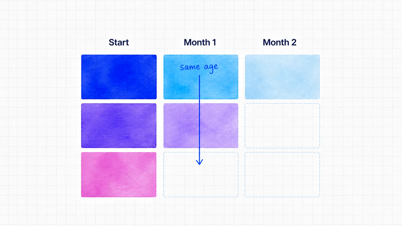
The resulting table usually places cohort start dates in rows and elapsed periods in columns. Reading across a row shows how one cohort changes. Reading down a column compares cohorts at the same age.

SaaS example
A SaaS company compares two monthly acquisition cohorts. Both start with 200 paid accounts. After three months, 150 accounts remain in the first cohort and 170 remain in the second.
The team finds that the second cohort received a revised onboarding sequence and reached the activation event sooner. That does not prove onboarding caused the difference, but it gives the team a testable hypothesis. It can repeat the change, inspect behavior, and monitor logo retention as later cohorts mature.
Revenue cohorts can answer a different question by tracking retained recurring revenue rather than account count. That analysis should stay distinct from NRR, which summarizes expansion, contraction, and churn for a defined starting revenue base.
Common mistakes
One mistake is defining a cohort after seeing the result. That makes it easy to select a flattering group rather than test a useful question.
Another is comparing cohorts at different ages. A six-month-old cohort has had more time to churn than a two-month-old cohort.
Small cohorts also create volatile percentages. A large visual difference may represent only a handful of accounts.
We see cohort analysis as a way to turn an average into a diagnosis. The chart is not the conclusion. Its job is to show where the next investigation or experiment should begin.